Bright Text Over Dark Backgrounds
Text | Fonts
Many people seem to have been influenced to believe that text is more easily read when it is dark and on light colored backgrounds. We believe the opposite is true; that light colored text is easier to read on dark colored backgrounds. This understanding stems from our perception of a particular optical illusion many have experienced before. But before we share this optical illusion with you, we’ll ask a simple question that will let you know that you already understand what we are about to share: Which is easier to read, larger or smaller text?
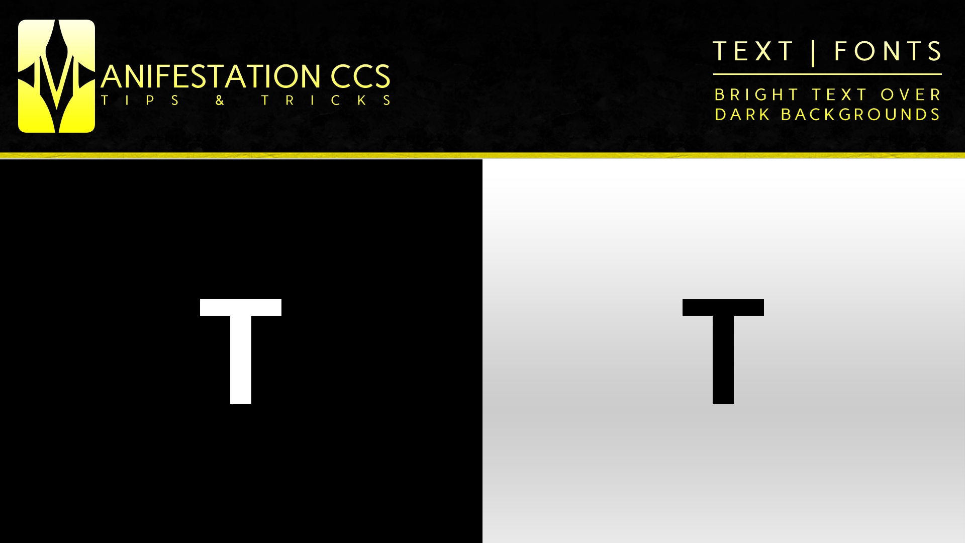
OPTICAL ILLUSION (WHICH SQUARE IS LARGER)

- If the white square was your answer, you are not alone. The vast majority of people’s perception of size is tricked when darker objects are placed over brighter backgrounds and vice versa. The squares above are the same size. Our minds tend to perceive bright objects over darker backgrounds as being larger than dark objects of the same size over bright backgrounds. This same optical illusion plays a role in our perception of bright type over darker backgrounds and dark type over brighter backgrounds.
TYPE EXAMPLES IN PRACTICE
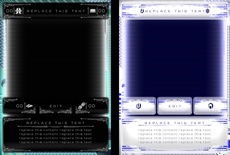
- The examples above show the same phenomena occurring in card template designs. If we were to ask which card’s text is more easily read, the vast majority of answers would be the left card (bright colored text over dark background). The text font, size, and placement are exactly the same; but in order to allow the dark text to be more legible over the bright background on the right card, we had to add a 1px, slightly opaque stroke to the text.
WHAT DOES THIS MEAN FOR YOUR DESIGNS?
- It depends on the colors of your design elements. A general rule may be a designer’s ability to use smaller, thinner, and/or more condensed text over darker backgrounds (meaning darker backgrounds may be more ideal when working with larger quantities of text / characters); and a designer using larger, thicker, and/or wider tracked text for clearer visibility over brighter backgrounds.
- Let us know your thoughts, ideas, and experiences related to working with darker text over brighter backgrounds and brighter text over darker backgrounds.