Best Positions for Icons and Symbols in a Card Design
Icons - Placement | Location
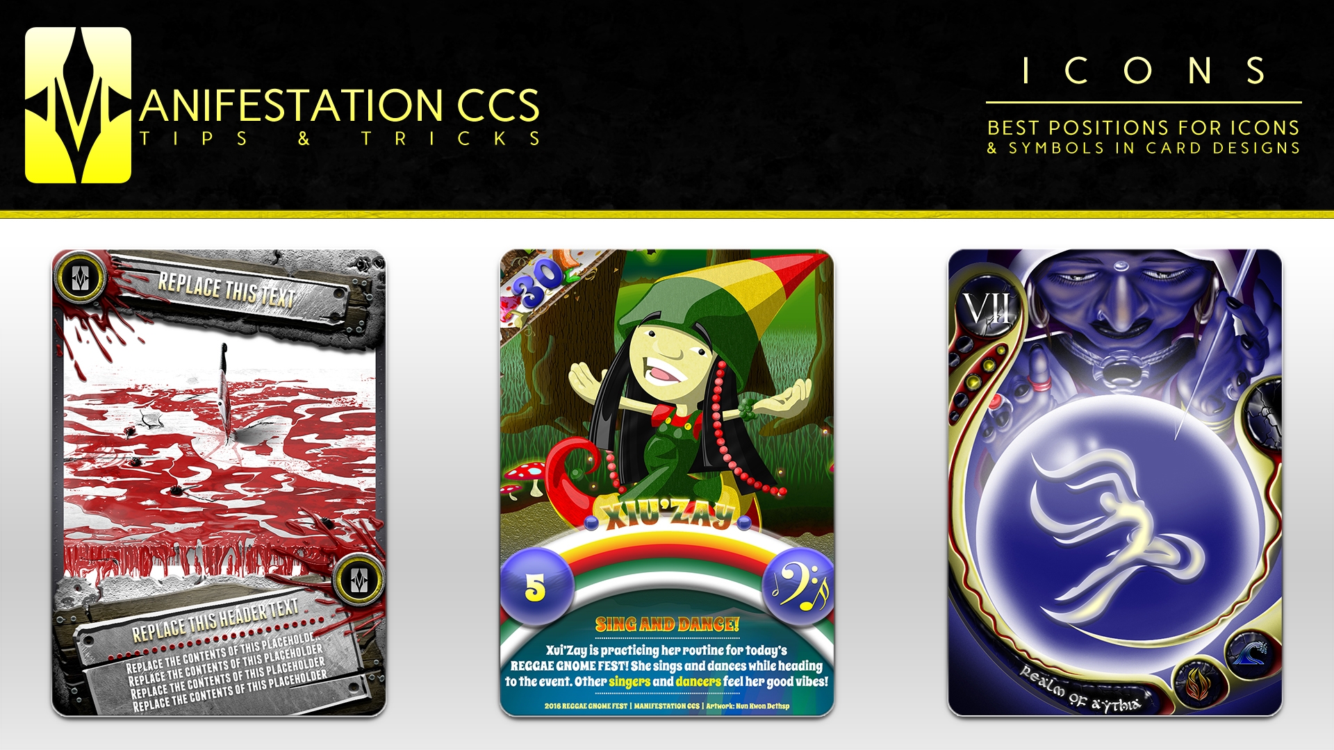
Icon and symbol placement in card designs needn’t be tricky with these when the following focuses are considered:
1) Importance of information relayed by icon: How important is the information the icon gives to players viewing the card? If the information relayed is critical to the immediate progress and/or flow of your card game, it is vital that the icon be placed in areas unobstructed by:
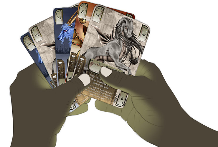
- Your players’ hands (while holding the card[s])
- Other cards (while spread in your players’ hands, when positioned on mats or game boards, and/or when using game mechanic positioning)
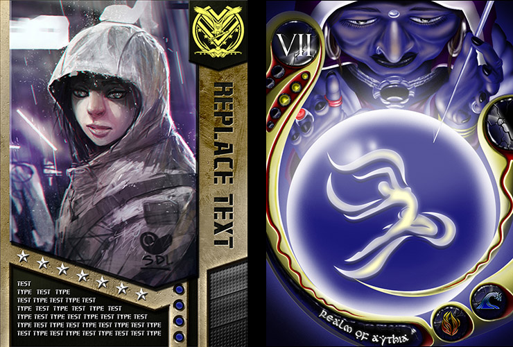
2) Style of the icon: Is the visual theme/style of the icon similar enough to other design elements of the card that it might blend in/camouflage?
- If yes it may be best to situate your icon away from other elements of a similar visual theme/style.
- If no you may find it easier to place your icon near other design elements without card viewers overlooking it.
3) Isolated placement vs placement near text.
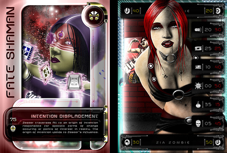
- Icons that are positioned away from other elements of a card work best when they highlight important information or functions of a card. Isolated icons are typically different in visual style and size when compared to other bodies of information on the card. These icons typically have no problems being highly detailed in their style/design.
- Icons that are positioned near text tend to work best when they reinforce ideas from the text they are near, give instruction for text they are near, or define the text they are near. In many cases the size of icons placed near text work well if they are similar in height to the text/characters they are around (if not slightly larger), and not overly detailed in their style/design.

